Gutenberg WordPress (Part 11): How to Create Responsive Client Logo Section
Published on
In the previous Gutenberg WordPress tutorial, you have successfully created a responsive slider. In this section, we will learn how to create responsive client logo section on Homepage.
This setting is important to ensure that the logo display adjusts to different devices used by users. So, when the website is viewed on a mobile device, the logos will still be clear and visible.
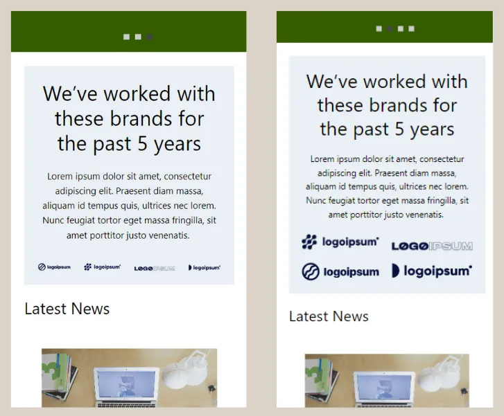
After practicing this tutorial, you will be able to customize the appearance of the client logo section on mobile devices as shown below:

Non-responsive client logo section (left) and responsive client logo section (right).
The process of creating responsive client logo section can be divided into two steps: (1) dividing the logos into separate groups, and (2) making the existing logos within the group responsive.
Step 1: Divide the Logos into Groups
In this initial step, we need to turn the existing logos into a Group block. By using the Group feature, you can manage the client logos collectively and make them responsive on the Homepage.
- In the WP Admin page, click on the Pages menu > access the Homepage page that you previously created.
- Open the List View on the left side and the Settings on the right side. This is to facilitate the settings.
- In the List View, select the Group block that contains the client logo or partner section.
- Select two Image blocks for the client logos through the List View > click the three dots > choose the Group option.
- Repeat the same steps for the next two logos.
The above steps are performed for the case of 4 logos in one section. If you have more than four logos, you can adjust accordingly. For example, if there are 6 logos, you can divide them into two or three groups.
Step 2: Create Logo Group to be Responsive
You are prepared to make the logos responsive in this next step. We don’t need to utilize any responsive plugins in this case.
We will simply utilize the basic settings of the Gutenberg editor in WordPress, specifically the Allow to wrap multiple times feature. Here are the steps:
- Select one of the logo groups > look at the Settings section on the right-hand side and change the Group to Row.
- Do the same for the next Group logo.
- Select all the Row blocks that contain the logos together (hold the Shift key + click the Row blocks) > in the Settings, enable the toggle for Allow to wrap to multiple lines.
- Done! You can now see the result on the front-end. Click Update first, then click Preview.
Important note:
Make sure that both Group blocks, which each containing a logo, have been changed to Row blocks (step 1). If this step is not done, the Allow to wrap to multiple lines feature will not appear.
You can see the desktop version and mobile version as shown in the images below. To check the mobile view, please press the Shift + Ctrl + C key combination on your keyboard.
Example of client logo section that has been responsive. The left side is a view from desktop, and the right sider is a view from mobile.
Conclusion
This brings to a conclusion of the instruction on how to create responsive client logo section using Gutenberg, allowing the arrangement of the logos to change according to the user’s device’s screen.
After successfully making the client logos responsive, our next step will be to learn how to make the list post and gallery sections on the Homepage responsive as well.
Indeed, creating each responsive feature and design element of a website and fully functional can be quite challenging. If you are looking for a professional team to handle these tasks, Tonjoo’s team is the solution.
We have extensive experience in developing websites for both local and international clients, ensuring excellent responsiveness, as seen in projects like Polygon and Unilever.
Let’s discuss your website ideas and requirements through our contact at Tonjoo, and we will assist you in making them a reality!
Read related articles about WordPress, WooCommerce, plugins, and website development by Moch. Nasikhun Amin on the Tonjoo’s blog.
Updated on July 17, 2023 by Moch. Nasikhun Amin