How to Create Slider in WordPress using Gutenberg Block Editor
Published on
In this fifth part of the Gutenberg WordPress series, we will learn how to create slider in WordPress only using the available block editor. However, it is expected that you have successfully followed the previous tutorial, which is creating the Footer.
A slider is a feature on a website that is used to display multiple images or text with transition effects. It can be manually navigated or set to slide automatically.
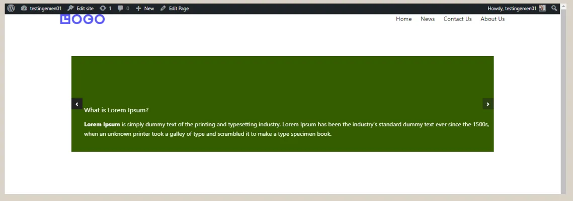
The term Slider is also commonly referred to as Carousel. The end result of creating a slider here will look like the following image:

The final result of creating a Slider or Carousel in WordPress using Gutenberg.
To create a slider in WordPress using the Gutenberg editor, there are three basic steps that need to be done, which are (1) creating the heading & paragraph, (2) setting the background & color, and (3) adjusting the padding.
Table of Contents
Step 1: Creating Heading and Paragraph for Carousel/Slider
In this first step, we will create the framework of the Slider or Carousel first, and then fill it with the heading and paragraph.
To create the heading and paragraph in the Slider, we will utilize three types of blocks provided by Gutenberg and Gutentor, namely the Carousel block, Container/Cover block, Spacer block, Heading block, and Paragraph block.
- In the WP Admin page, click on the Pages menu in the left sidebar, then click on Add New.
- Next, click [+] > type carousel > and select the Carousel block. The Carousel block will be used as a slider on the website.
- In the carousel block, click [+] > type container in the search box > select the Container/Cover block. The Container block is used to group and arrange the layout of blocks easily.
- In the container block, click [+] > type spacer in the search box > select Spacer. This block is used to create visual spacing within the Slider.
- Still in the container block, click [+] > select Heading to add a title to the slider.
- Next, customize the Heading by clicking on the Settings at the top right corner > under the Typography section, select Size Medium (M) to change the heading size. Then, please enter the desired heading text.
- In the same container block, click [+] below the Heading and select the Paragraph block. This block is used to create a paragraph below the Heading.
- Once it’s done, please fill in the paragraph.
- Adjust the paragraph size by clicking on Settings > in the Typography section, select the Small (S) size.
- Repeat steps 3 to 9 for the remaining two Carousel Single Column blocks.
Now, at this stage, the Slider still has a very basic appearance. Therefore, you need to tidy it up first and also add colors to each element.
Step 2: Setting the Colors and Size of the Slider
Once you have finished creating the content within the slider, you can now add background colors and text colors to the slider.
Additionally, you will also need to adjust the size of the slider. Here are the steps to do it:
- Click on the first Carousel Single Column > click on Settings in the top right corner > click on Background > choose Color > please select the desired color. Repeat the same process for the other Carousel Single Columns.
- To change the text color, click on the text blocks such as Heading and Paragraph > click on Settings > in the Color section, click on Text > choose the desired color. Repeat the same process for other text elements.
- If you’re done, open the List View and click on the Carousel > click on the three dots in the Carousel > select the Group option to combine all the elements in the Carousel.
- If you’re done, in the Settings section, change the Wide or width size of the slider to 1200.
- Click on the Carousel again, then in the Settings section, go to Basic Options > change Slide To Show to 1 > change Slides To Scroll to 1.
- Scroll down and make sure the Enable Infinite Loop and Enable Autoplay toggles are activated.
- Then, click on the Carousel again > on the toolbar that appears above the Carousel, change its size to Wide width.
- Done, the Slider you created in Gutenberg WordPress will look like the one below.
As you can see above, the slider is already functioning. However, the text inside the slider still needs some adjustment. Therefore, you need to adjust the padding settings.
Step 3: Adjusting Slider Padding
Padding refers to the empty space between content on a website. By adding padding, the elements within the slider will appear more organized. Here’s how to adjust the padding:
- Open the List view and click on the Carousel Single Column.
- Open Settings, then click on Margin/Padding > fill in the Padding section with the desired size. We are using a size of 20 for Top, Right, Bottom, Left.
- Repeat the same steps for the other Carousel Single Columns.
If done, the final result of creating this slider will look like the following:

The final result of creating a Slider or Carousel in WordPress using Gutenberg.
Conclusion
That concludes the tutorial on how to create a slider in WordPress using the Gutenberg editor. The next step in building a simple website is to create a partner logo section.
However, if you’re looking to build a highly professional website, it is recommended to entrust the development to a professional service like Tonjoo. This way, you can save time and ensure a high level of professionalism.
We have extensive experience in developing websites for clients such as Astra Isuzu, Futureskills, and Rey. If you’re interested in creating a similar website, feel free to contact us through Tonjoo’s contact information.
Read related articles about WordPress, WooCommerce, plugins, and website development by Moch. Nasikhun Amin on the Tonjoo’s blog.
Updated on October 26, 2023 by Admin Tonjoo