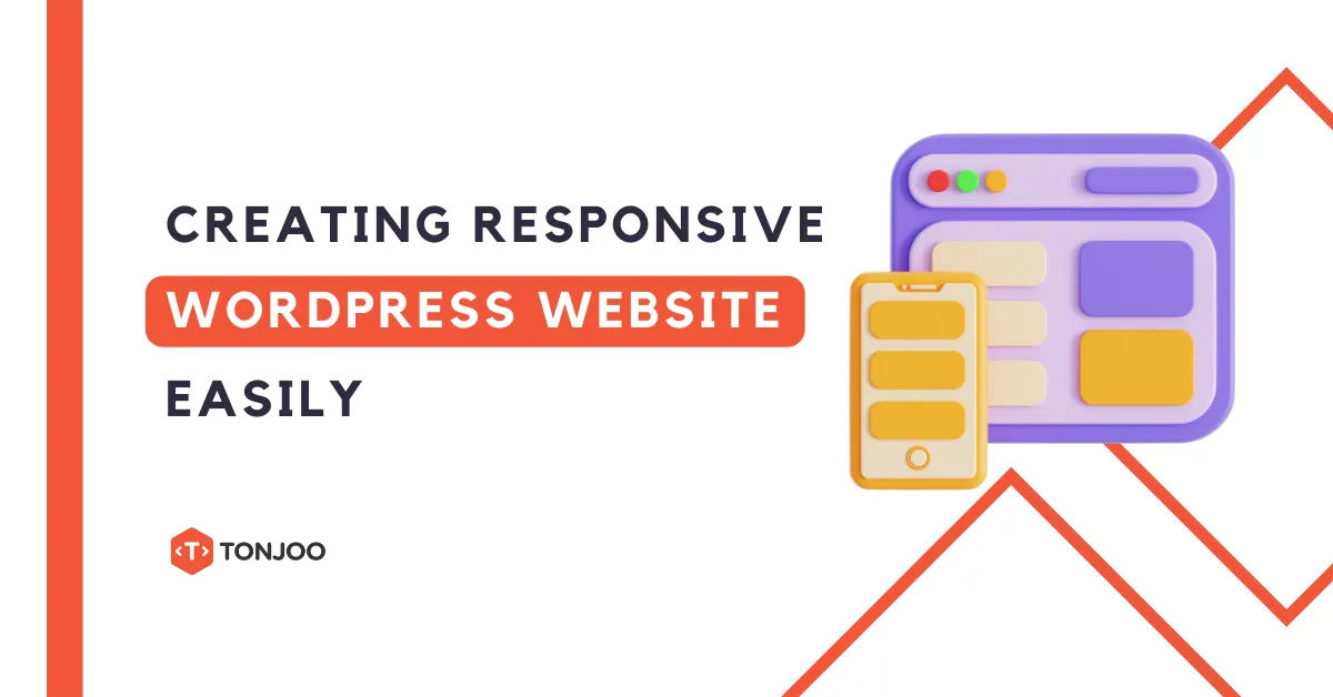
Responsive WordPress Website – With increase in mobile browser usage compared to desktops, creating responsive websites has become a need more than just a fad. Without a mobile version of your website, you may lose a lot of potential users, depending on the amount of traffic that is coming to your website from mobile devices.
If you’re already running a WordPress site for desktops and are thinking about going mobile, you’ll probably consider building a responsive WordPress site from the ground up. But that’s not necessary unless you’ve good programming skills and knowledge.
In this post, we will talk about some incredibly useful and easy-to-follow tips that will help to make the process of creating a responsive website become a breeze.
Table of Contents
Create Responsive WordPress Website with Plugins
In case you’re running a content-heavy website, for example, a WordPress blog, then you won’t be too distressed about how your site looks when viewed on a mobile device. Instead, you’ll most likely want your site visitors to read your website content without the need to zoom in.
Put it simply, if you’ve designed a site for the purpose of reading, then rather than squeezing the content to fit according to a pixel-perfect design is not necessary. And you should pay more attention to designing for content.
Fortunately, there are tons of plugins out there that helps in making your content mobile-friendly. And the most recommended plugin that can be used to accomplish this objective is WP Touch.
This plugin enables you to show your content on your blog posts or pages to mobile users, without making any changes to how the content is displayed on a desktop.
Using Pre-Built Responsive Themes
One of the simplest and quick way to meet your needs to come up with a good-looking responsive WordPress website theme is to search for pre-built themes.
With plenty of ready-made WordPress themes over the web, you’ll definitely find one as per your needs. These themes help to make your design consistent across mobile devices and desktop. The least you’ll be required to do is to make a few tweaks to the theme.
Let’s now have a quick look at some mobile themes, you can choose to build your responsive WordPress website:
WordPress’s Twenty Series: Right from Twenty Eleven and higher versions, WordPress’ standard theme enables you to make a simple yet responsive theme for mobile users. Though, the themes in the series doesn’t contain many features, but are definitely worth a try for startups.
Scherzo: If you’re looking for a theme that is based on the concept of mobile-first approach, then Scherzo is the right choice for you.
Apart from the aforementioned themes, you can also opt for Optimizepress2, Jigoshop, and many more.
Make Existing Theme Responsive Using Media Queries
Instead of throwing your existing theme and building a responsive one from scratch, a good practice is to give users a mobile experience, at least visually similar to your desktop-themed website. This can be achieved with the help of CSS media queries.
When writing a media query, you need to focus on including three main parts:
- The @media rule;
- The type of media (i.e. screen, print, mobile phone, etc.);
- max-width (i.e. maximum width) of the target device screen.
Here’s a code snippet that will help you understand how you can write a CSS media query for responsive WordPress website:
[code language="css"]
@media screen and (max-width: 1024px) {

/* works for Tablet styles */

}

@media screen and (max-width: 700px) {

/* works for Mobile Phone styles */

}
[/code]
As you can see, we’re using @media rule in the above code which will help display the website in two different layouts: for tablet and mobile phone.
Using CSS to Make Images Responsive
Making the images responsive in responsive WordPress website has been one of the most common and important topic of discussion in the web industry. You’ll find several tutorials and resources online suggesting best practices, following which you can make your website images responsive.
But, going through all of them can be a quite daunting. However, one simple solution that you can use to make images responsive on your website is to make use of CSS.
One common CSS solution you can use for making the images responsive is to assign your images a max-width of 100%, as shown below:
[code language="css"]img { max-width:100%; }[/code]
Wrapping Up!
As an increasing number of users prefer to browse the web using mobile devices than desktops, site owners who aren’t still having a mobile version of their WordPress website should consider to create one.
Most of you would probably plan on building a responsive WordPress website from scratch. However, if coding isn’t your thing, a better solution is to make use of the available resources and tools online to get the job done.
I hope that the tips I have covered in this post will help you get a general idea as to how you can proceed with turning your existing website into a mobile-friendly theme without much hassle.
Using WordPress, you can also create your own online store by installing WooCommerce and adding the best WooCommerce plugins.
However, if you want to focus on your business and avoid the hassle of website development, you can collaborate with the Tonjoo Team, specialists in website development with over 10 years of experience.
We have worked with governments, corporations, and startups. Some examples of our work include Borobudurpark, Universitas Gadjah Mada, Futureskills, and Hello Health Group. Contact us to collaborate!

Read similar posts by Moch. Nasikhun Amin on the Tonjoo’s blog about WordPress, WooCommerce, plugins, and other web development subjects.
Updated on May 10, 2024 by Moch. Nasikhun Amin
