If you have successfully created responsive header and footer, the next step is to create responsive slider so that your website can adapt to mobile users.
However, before creating a responsive slider, you need to customize your homepage first, including background settings, typography settings, and then proceed to make the slider responsive.
Once you have completed the first three steps, you can proceed to the fourth step, which is configuring the responsive slider. You can follow the table of contents below for guidance.
Table of Contents
Step 1: Setting up Homepage
When you open the front-end homepage, you may wonder why the previously created homepage is not appearing. Instead, the display may look similar to this:
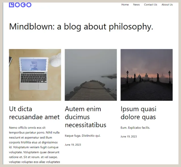
The Homepage before it is set up.
In Gutenberg WordPress, the homepage is not set as the default front page because WordPress uses static settings to determine the site’s homepage.
You can set the created homepage as the landing page by following these steps:
- Click on the Pages menu > select the Homepage that was created earlier in the WordPress slider tutorial.
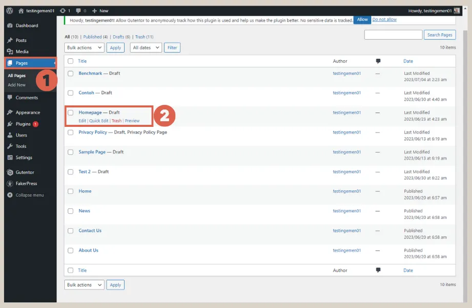
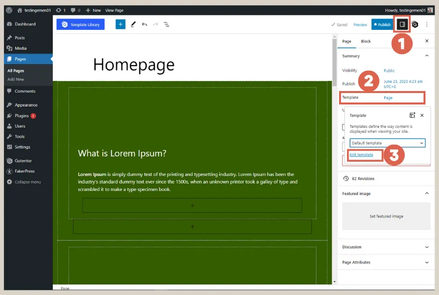
- On the Homepage editor page, click on Settings in the top right corner > click on the Template option > click on Edit template.
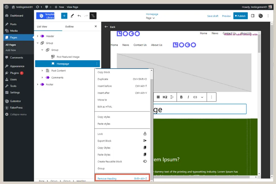
- Click on the text Homepage > open the List View > click on the three dots.
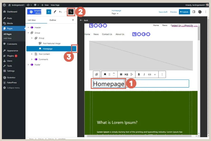
- Select Remove Heading to delete the text block.
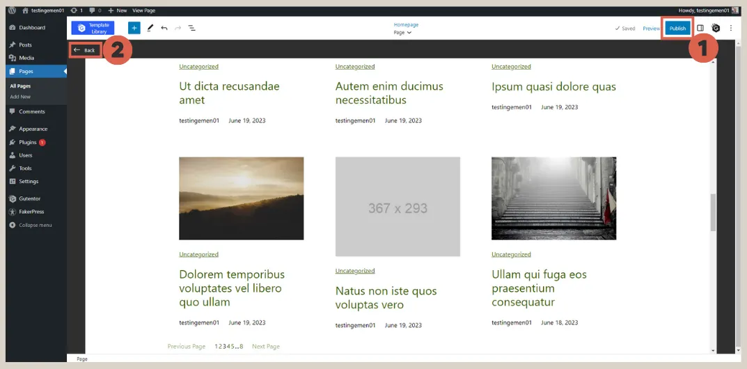
- Click on Publish > then click Back to exit the template editor.
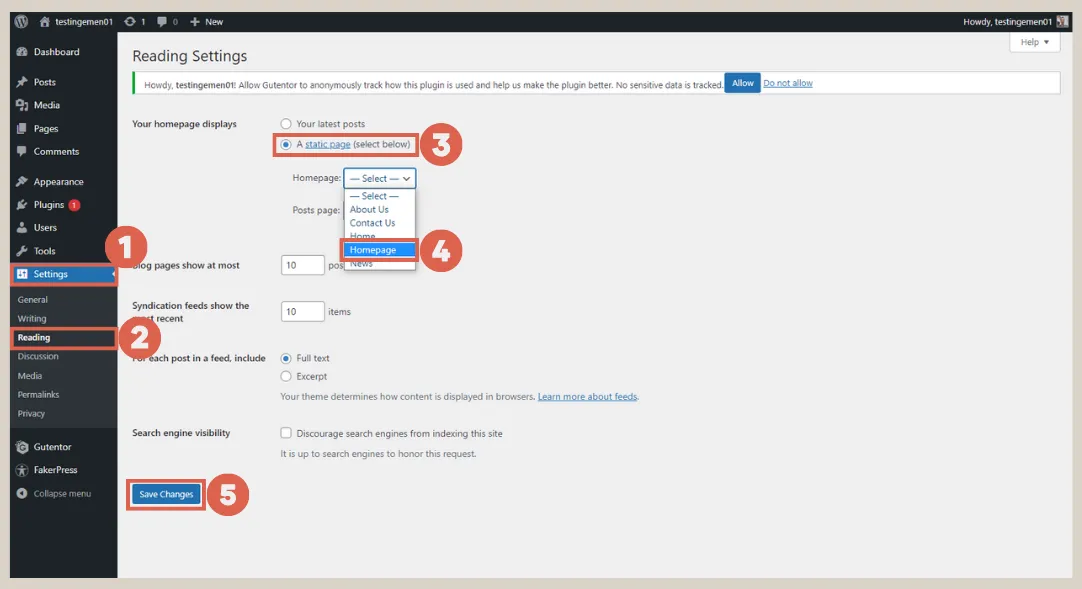
- In the WP Admin menu, select Settings > select Reading > under Your homepage displays, choose A static page > for the Homepage option, select Homepage. And lastly, click Save Changes.
When you visit the website’s main page, the created Homepage will now appear. The display will be similar to the following:
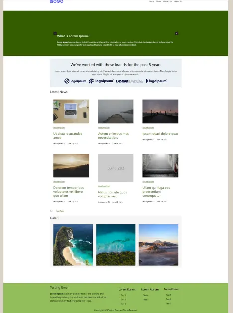
Creating responsive slider on the homepage.
Step 2: Background Settings for the Slider (Carousel)
Next, you need to configure the background color for the slider. This setting is optional and does not have a significant impact on the responsive features.
To configure the background, go to the Pages menu > click on the Homepage as you did before. Then follow these steps:
- Open the List View > click on the Carousel block.
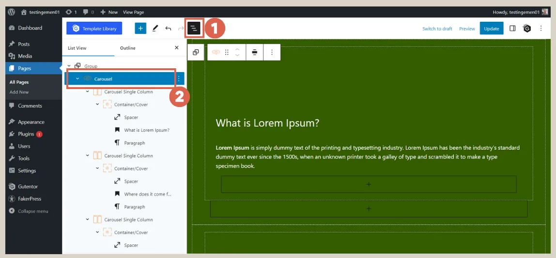
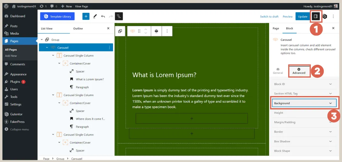
- Click on Settings in the top right corner > select Advanced > choose Background.
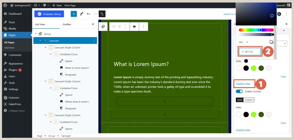
- Click on Custom color > change the background color according to your needs.
Step 3: Setting Typography on the Slider
Before you create responsive slider, make sure that the typography on the slider is well-set up. To set the typography, do the following steps:
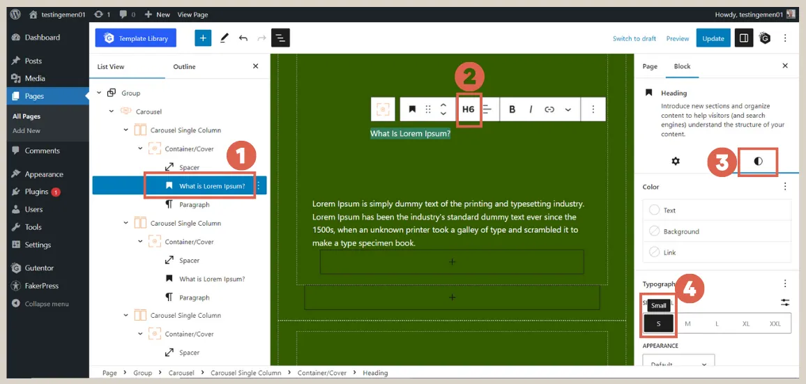
- Look at the List View on the left side and click on the Heading of one of the Carousel Single Column blocks > change the heading to H6. In the Settings column, click on Styles > under Typography, select the Small (S) size.
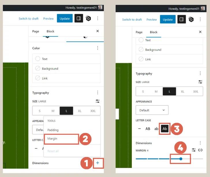
- Scroll down and click on the + sign in the Dimensions section > choose Margin > Under Letter Case, select Ab, then change the margin size to 4.
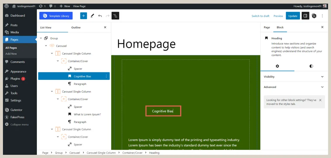
- Modify the text in the heading according to your needs. We filled in Cognitive Bias.
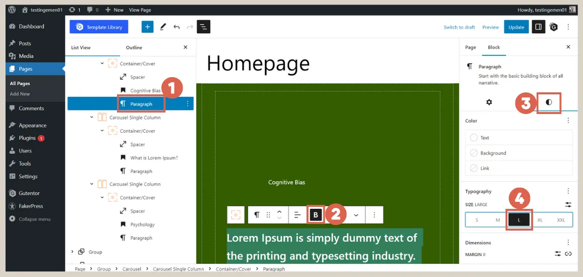
- In the List View, select the Paragraph block > make the text Bold. In the Settings, click on Styles > change the Typography size to Large (L).
- Next, change the Margin to 4.
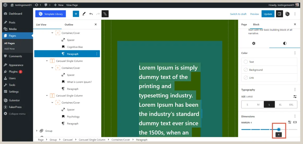
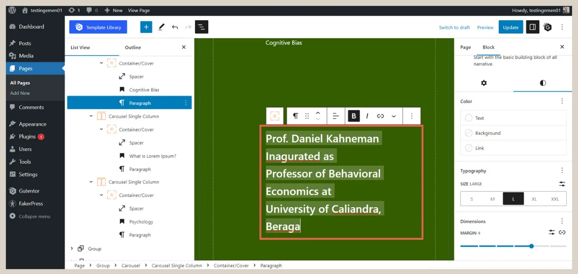
- Once done, fill in the Paragraph block as needed. We entered the text “Prof. Daniel Kahneman Inaugurated as Professor of Behavioral Economics at University of Caliandra, Beraga”.
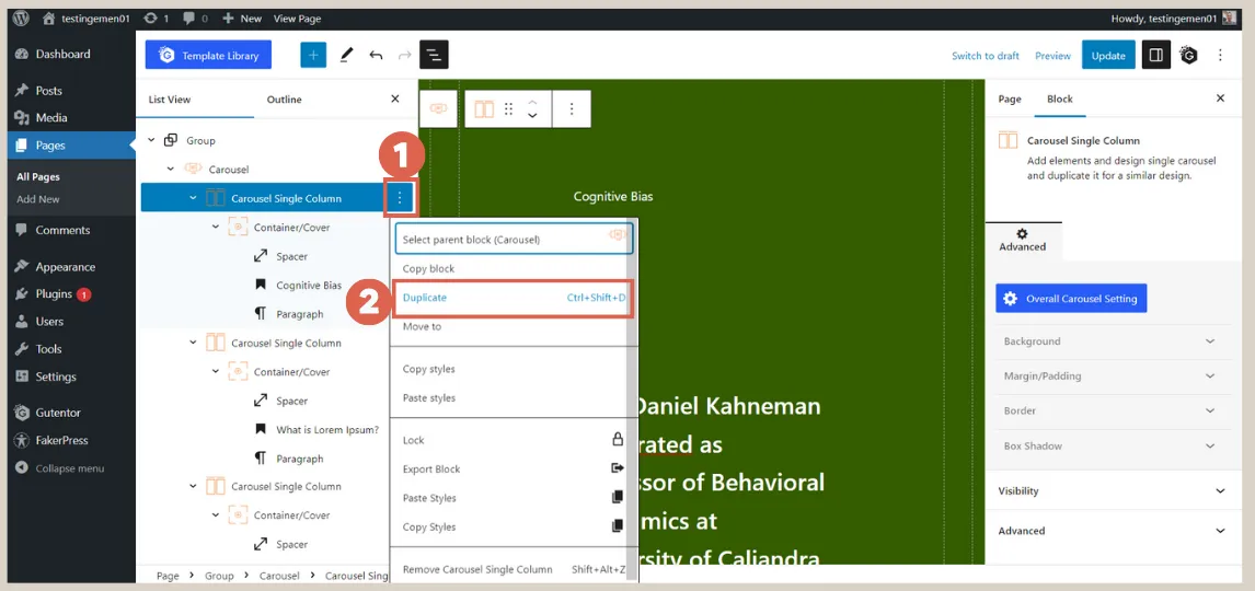
- Select the Carousel Single Column block that you edited, then click on the three dots > choose Duplicate twice so that you don’t have to make the settings again. The old Carousel Single Column block can be deleted.
You can fill in the duplicated second and third sliders. Once done, these sliders can be made responsive.
Step 4: Make the Slider Responsive for Mobile and Tablet
To create responsive slider, follow these steps:
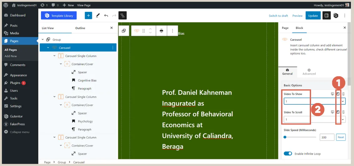
- Look at the List View and select the Carousel block > in the Settings section, ensure that the Slides to Show and Slides to Scroll options are set to 1.
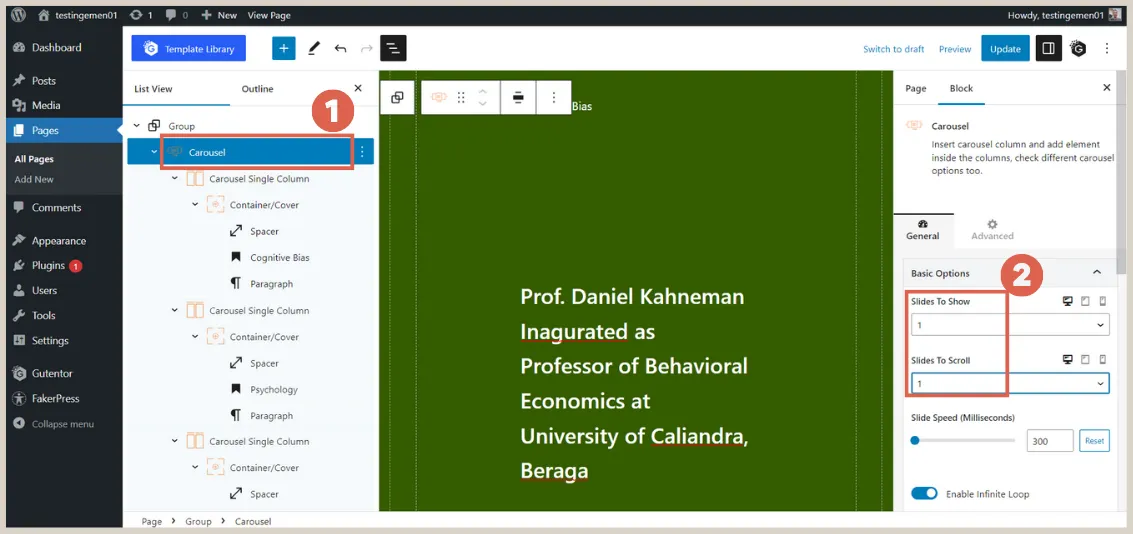
- Next, click on the Tablet icon in the Basic Options > change the Slides to Show and Slides to Scroll to 1. This is the setting for tablet responsiveness.
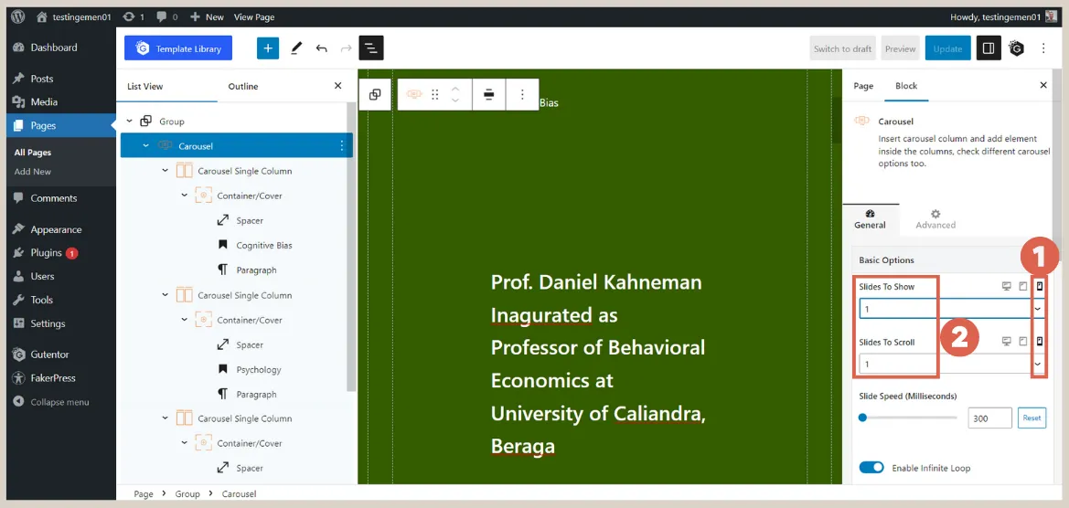
- Click on the Mobile icon in the Basic Options > change the Slides to Show and Slides to Scroll to 1. This is the setting for mobile responsiveness.
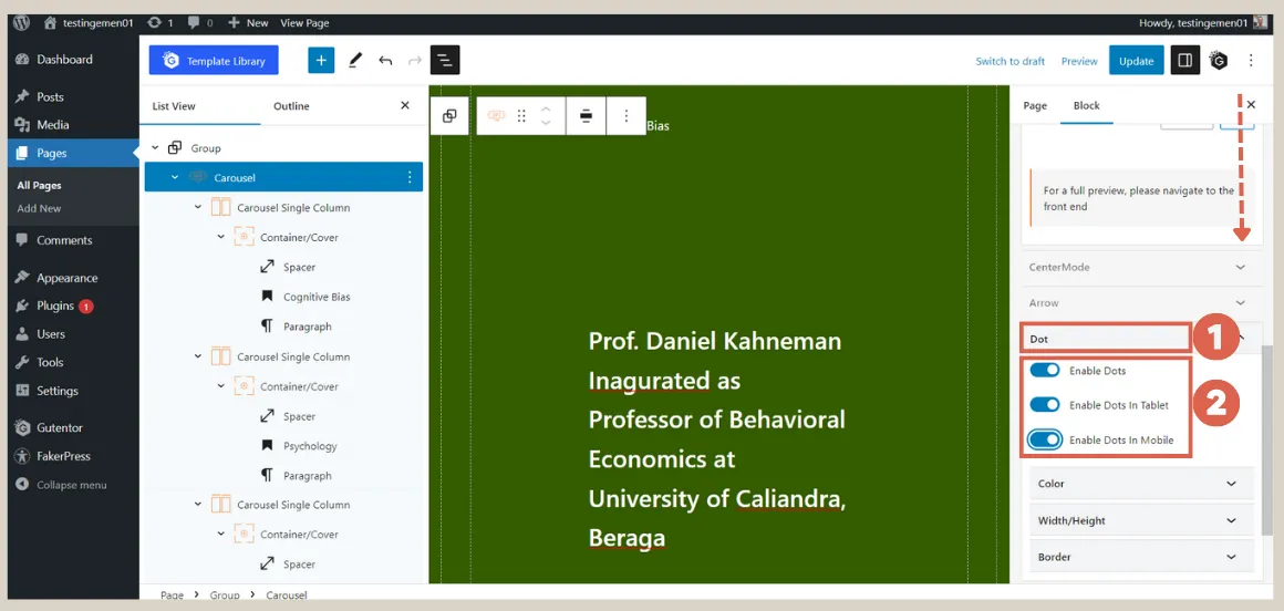
- Scroll down and click on the Dot section. Activate all the toggles: Enable Dots, Enable Dots in Tablet, and Enable Dots in Mobile. This setting displays dots at the bottom of the slider.
Finally, you can Publish the changes and preview the results on the front-end.
Conclusion
That sums up the tutorial on how to create responsive slider using the Gutenberg editor. Next, you need to make the list of posts and the gallery responsive as well.
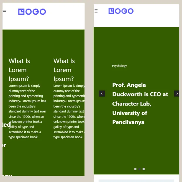
Here is a comparison of the homepage’s appearance on mobile, before and after making it responsive. Additionally, you need to make the client logo section responsive.
However, the website creation process can be time-consuming. Don’t let the task of creating a well-designed website hinder your business.
You can trust your website needs to the Tonjoo Team, a professional software development company with experience in handling both start-up and multinational company websites.
Let’s discuss your ideas and website requirements through our contact information to bring your ideal website to life!
Read related articles about WordPress, WooCommerce, plugins, and website development by Moch. Nasikhun Amin on the Tonjoo’s blog.
Updated on July 28, 2023 by Moch. Nasikhun Amin


