


![How to Design a Website Layout in 5 Easy Steps [+ Types of Layout]](https://cdn-prd.tongkolspace.com/tonjoo/wp-content/uploads/2026/07/how-to-design-a-website-layout.png)
When creating a website, the way you design the layout plays a crucial role in determining its overall appearance and usability.
A website layout is like a house floor plan. Paint colors and decorations make a home look beautiful, but if the floor plan is poorly organized, people will still feel lost. The same principle applies to websites. When visitors visit the page, they usually check the entire layout of the page.
A well-structured layout helps your website look professional, modern, and trustworthy. In contrast, a cluttered or unbalanced layout can leave users feeling confused and frustrated.
Therefore, it would be good to look at examples of website layouts and learn how to design them to make your website easy to read and provide a comfortable user experience for your audience.
Let’s get straight to it and start designing a website layout that will propel your business forward in the digital world.
Table of Contents
Criteria for Good Website Layout Design
Are you ready to grow your business in the digital world through a more modern approach? With more than 1,94 billion websites worldwide, it is clear that businesses are leveraging the internet to promote their brands, conduct transactions, reach new customers, communicate effectively, and deliver digital services.
To get started, you need to focus on creating a well-designed website layout that provides a positive, immersive, and engaging user experience, especially for prospective customers.
From intuitive navigation to visually appealing design, a thoughtfully structured layout can help attract visitors, enhance their comfort while browsing, and increase the likelihood of subscriptions or conversions.
An effective website layout should incorporate the following qualities:
It Has a Clear Hierarchy
An effective website layout should establish a clear visual hierarchy. In other words, visitors should be able to instantly identify the most important information and distinguish it from supporting content. This can be achieved through elements such as heading sizes, element placement, button colors, visual contrast, and more.
For example, the main headline on a landing page should be larger than the accompanying paragraph text, as it is intended to capture the audience’s attention first. Likewise, call-to-action buttons such as “Pricing” or “Contact Us” should stand out with bold, high-contrast colors so they remain highly visible and easy to recognize.
Easy-to-Understand Navigation Menu
Navigation menus and buttons should be simple and intuitive, enabling visitors to quickly locate important pages or the information they need. Besides that, the website should use clear menu labels, place navigation elements where they are easy to find, and ensure that the mobile version remains convenient to use while scrolling.
Conversely, if users feel they have to guess the contents of the menu, they will likely close your website and switch to another one.
Well-Organized Content
Well-organized content creates a natural flow, with information presented from the most important points to supporting details. For example, the header section should introduce the website or its primary service, followed by the features offered, the value of the products or services, pricing information, and the solutions provided.
When a website feels intuitive, visitors are more likely to stay longer and explore its pages. Conversely, poorly structured or disorganized content can make the browsing experience feel complicated and frustrating, ultimately driving visitors away.
Effective Use of White Space
White space refers to the space between design elements. It requires consideration to ensure the website feels spacious and the content is easy to read, avoiding a cluttered or overcrowded appearance.
Additionally, effective use of white space helps guide visitors’ attention to key elements, gives the design a more professional look, and makes the website look cleaner.
The Visuals are Consistent
An attractive and effective layout maintains visual consistency throughout the website. This means that the design style, spacing, element sizes, button shapes, and section patterns aren’t changed without a reason. For example, if all primary buttons are blue, another primary button should not suddenly appear in red unless there is a clear design reason behind the change.
Visual consistency plays a crucial role in strengthening your brand identity, conveying professionalism, and shaping how potential clients perceive your website.
Ultimately, choosing the best WordPress theme and implementing a well-structured design can create a positive user experience and have a lasting impact on the future success of your business.
How Do You Create a Website Design Layout?
Before creating a website layout, you must understand the website’s purpose and how it will be used. A layout is more than an arrangement of images, text, and buttons; rather, it’s the way you organize information so that visitors can easily understand your content.
If your goal is to sell products or services, the layout should emphasize your offerings and make purchase buttons highly visible. For a portfolio website, the focus should be on showcasing your projects and providing clear contact information. Meanwhile, if you are building a corporate website, the layout should be designed to establish credibility and foster trust with your audience.
By understanding the principles and objectives outlined above, you can design a website that effectively delivers your content, showcases your products or services, and strengthens your professional brand identity, ultimately leading to higher website conversions.
Here are the steps to create a website layout that aligns perfectly with your needs and business goals:
Step 1: Identify the Primary Purpose of Your Website
A clear understanding of your website’s purpose will guide your design decisions and ensure that your site effectively meets the needs of your target market.
- Define the primary objective of your website.
- Identify your target audience and customer segments.
- Understand the needs and expectations of your prospective customers.
- What actions do you want visitors to take?
- What kind of brand or image do you want to present to visitors?
Understanding these basics will help you choose the right layout for your website. However, if you are still unsure about determining the details of your website layout design, hiring a professional web development service can be the best option. A web design service company can transform your ideas and requirements into a complete website layout.
The information you provide to your website development partner will significantly influence the time required to design and build your website. The clearer your ideas and objectives are, the faster the layout design process can be completed.
Step 2: Mapping Out Your Website’s Content and Features
The second step is to map out the content and features that will capture your audience’s attention by identifying the pages you need and their respective functions.
Generally, business websites feature a home page, an “About Us” page, and a “Contact Us” page. Some also include news, blogs, catalogs, and other functions.
Next, combine these pages with user-friendly features such as intuitive navigation menus, powerful search functionality, and interactive elements that encourage visitors to explore your website and subscribe to your services.
If you want to create a simple website layout, it would be good if you avoid making the design too crowded with excessive elements. The goal is to prevent users from feeling overwhelmed while making it easier for them to find the information, features, or pages they need.
Instead, focus on the most important content and features that align with your website’s goals and target audience.
Step 3: Creating a Wireframe
With the content and features you have already mapped out, it’s time to move on to wireframing (a raw sketch of your website layout). This step is essential because it involves creating a basic visual representation of your website structure, helping you visualize how the content and features will be arranged together on a single page.
A wireframe typically includes image placeholders, text lines, button placements, section arrangements, navigation locations, and footer areas. This raw sketch can be created on paper, using tools like Figma, Whimsical, or other design platforms. The most important thing is that the overall idea and structure are clearly represented.
When creating a wireframe, avoid placing too many elements within a single area. Leave enough space or white space between sections to ensure that each part of the page has proper spacing. Besides creating a cleaner appearance, white space also helps guide users’ attention toward the most important elements, such as CTA buttons, navigation menus, or key information.
If your website will be accessed across multiple devices, the wireframe should also be designed for different screen sizes, including desktops, tablets, and smartphones. A responsive website design that works well on mobile devices will provide a more comfortable browsing experience for the majority of smartphone users.
Step 4: Choose the Right Color Palette
Choosing the right color palette for your website is an essential part of the design process. A color palette plays a significant role in improving readability, strengthening your brand or website identity, directing user attention, and shaping how audiences perceive your business or services.
A color palette typically consists of several types of colors, including primary colors, secondary colors, accent colors, and neutral colors.
Practically, choosing a color palette for website design should support user readability. This means the text and background colors should have sufficient contrast to ensure a user-friendly experience and make the content easy to read, even from a distance.
You can also select the right color palette using tools such as Adobe Color, Coolors, Khroma, and the Material Design Color Tool.
Step 5: Check Other Websites for Inspiration
After completing the four steps above, you may still need additional references for design inspiration. In that case, exploring other websites, especially the WordPress themes and templates they use, is a great idea.
Observe what makes these websites visually appealing and effective. Pay attention to elements such as their navigation menus, homepage design, color choices, and content structure. By analyzing other websites, you can gain insights into the strategies behind their layout implementation.
Moreover, website design trends continue to evolve every year. Reviewing other websites as references can help you stay updated on popular themes, design styles, and visual trends. However, it is important to evaluate trends wisely, as not every trend will be suitable or applicable to your own website.
However, if you encounter difficulties while analyzing visual trends, you can depend on Tonjoo’s services to obtain the necessary guidance and support throughout the design process. This is especially helpful when creating a unique website layout that effectively reflects your brand identity.
Some Examples of Website Layout Designs
Exploring different types of layouts through search engines can provide valuable insights and inspiration for your web design projects. Beyond expanding your references, you will also gain a better understanding of the advantages and flexibility offered by each type of website layout.
Let’s explore some examples of website layout types below and create the best possible experience for your website visitors!
1. Single Column
A single-column layout focuses on arranging all website content within one vertical column from top to bottom. This means users only need to scroll down to read or explore the page content without having to shift their attention across multiple columns.
Those who choose this layout typically aim to prioritize content readability through a clean and minimalist design approach. Therefore, a single-column layout is recommended for websites that publish content such as blogs or news sites, target mobile users, or want to highlight specific products or services.
Some examples of single-column layouts used on websites include:
- Medium uses a single-column layout to prioritize readability and minimize distractions, allowing readers to focus entirely on the content.
- Substack applies a single-column approach, especially on newsletter and article pages. The structure is simple, focusing on the title, author, article content, and subscribe button.
- Basecamp often uses a simple and focused layout approach, with content flowing naturally from top to bottom.
- Typeform is also known for using a single-column layout to support vertical storytelling, guiding users through its products, features, and benefits step by step.
- Apple highlights sleek and modern design principles on its product pages.
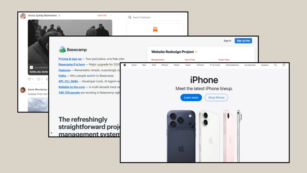
These are all examples of websites that use a single-column layout.
2. Split Screen
A split-screen layout is a website layout that divides the screen into two main sections, typically the left and right sides, where each side can contain different elements. For example, the left side may display text, while the right side showcases an image, video, graphic illustration, or other visual elements.
This type of layout is ideal for websites that need to present two equally important elements. Common examples include product landing pages, portfolio websites, e-commerce or online shop websites, and educational platforms.
Similar to a standard split-screen layout, an asymmetrical split-screen layout features sections with different sizes, creating a unique visual dynamic while emphasizing more important content or actions.
Some websites that implement split-screen layouts include:
- Stripe uses a balanced combination of text and product visuals across two separate areas.
- Dropbox applies a two-column layout to present features, benefits, and product visuals.
- Webflow also frequently uses a two-column layout to showcase explanatory text alongside product visuals.
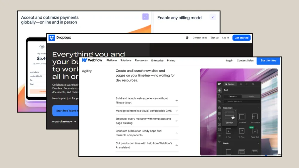
A bunch of example websites that use a split-screen layout.
3. Grid of Cards
A grid-of-cards layout presents content as neatly arranged cards in a grid, much like a digital catalog. Each card typically contains a single unit of information, such as an image, title, brief description, price, tag, or call-to-action button.
If you plan to showcase visual content such as portfolios, products, online courses, or articles in a clean and organized manner, this type of layout is highly recommended. Because each card can be quickly scanned by users, websites that use this approach are often intuitive and easy to navigate.
Here is a collection of examples of websites that use a grid of cards for their layout:
- Pinterest uses a grid-of-cards layout, making it easy for users to discover and browse a wide variety of high-quality visual content.
- Airbnb displays accommodation listings in card format, complete with photos, locations, ratings, and prices.
- Shopee uses product cards arranged in a grid, providing an excellent example of an e-commerce card structure.
- Dribbble showcases creators’ work using a grid-of-cards layout.
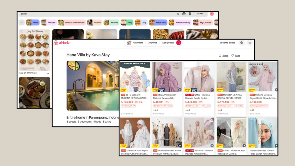
Some examples of websites that use a grid of cards
4. Magazine Layout
A magazine layout is inspired by the design of print magazines and editorial publications, making it a highly flexible option. This type of layout typically features a large amount of content presented in varying sizes and columns, complemented by prominent images, eye-catching headlines, featured articles, categories, and dynamic visual elements.
If you plan to publish a substantial volume of articles or diverse content without making every item appear identical, a magazine layout can be an excellent choice.
Some websites that implement a magazine-style layout include:
- The New York Times uses a magazine-style layout to present a wide range of news stories with compelling headlines and eye-catching imagery.
- Vogue employs an editorial layout featuring large photographs, bold headlines, and clearly defined categories such as fashion, beauty, culture, and lifestyle, making it an excellent example of a premium, visually driven magazine layout.
- National Geographic relies on striking visuals and powerful storytelling, serving as a valuable reference for photo-centric magazine layouts focused on travel, science, and culture.
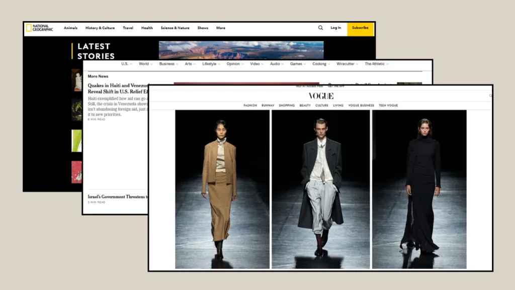
Examples of magazine layouts on various websites.
5. F Layout
The F-shaped layout follows the natural reading pattern of users, who tend to view content in an F-shaped formation; starting at the top of the page and reading from left to right, then moving down slightly to read from left to right again, but it’s usually across a shorter distance. After that, the eyes travel down the left side of the page to scan for key points.
This pattern reflects online reading behavior that begins with viewing the headline and scanning subheadings, followed by scrolling to locate important information. In short, users want to quickly find relevant information on the webpage without reading every section in detail.
The list contains examples of F-shaped layouts that can serve as inspiration, including:
- Amazon uses an F-shaped layout by placing its logo in the upper-left corner, followed by a prominent search bar and navigation menu across the top of the page.
- Wikipedia makes extensive use of text content, headings, internal links, and navigation elements that enable users to scan information.
- The search results pages of Google closely follow the F-shaped pattern, as users typically read from the top and then scan the titles and snippets along the left side of the page.
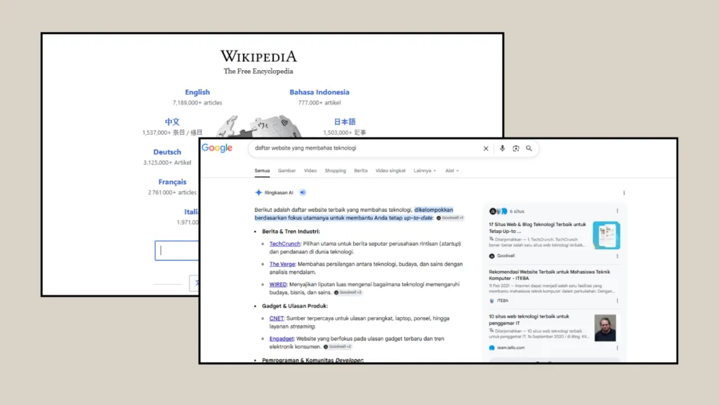
The F-shaped layout is also commonly found on the following websites above.
6. Z Layout
A Z-shaped layout follows the natural eye movement of users in a pattern resembling the letter “Z.” Typically, visitors begin by looking at the upper-left corner of the page, move across to the upper right, then scan diagonally toward the lower left before finishing at the lower-right corner.
This pattern is commonly used on simple web pages with minimal text and a single primary objective. For example, it can guide visitors’ attention from the logo and navigation menu to the main message and, ultimately, to a call-to-action button.
The list below contains examples of websites that effectively incorporate a Z-shaped layout:
- Dropbox uses a Z-shaped layout on its homepage, guiding users from the logo to the headline, then to the descriptive text, and finally to the call-to-action button.
- Slack frequently applies hero sections with strong headlines, top navigation, compelling product visuals, and easily accessible CTAs.
- Spotify often uses simple yet visually striking layouts with clear calls to action on its promotional and campaign pages.
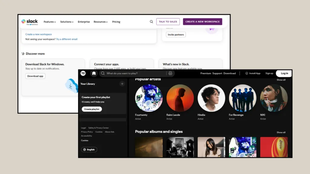
Websites that implement a Z-shaped layout.

Updated on July 10, 2026 by Anisa K.
